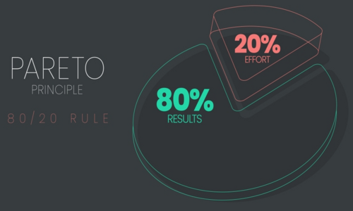
Have you ever felt that there are several issues swimming in your head and you have no clue where to begin? With the Pareto Principle, you will probably soon realize that 80% of outcomes derive from 20% of the causes. Welcome to the Pareto diagram, a visual tool that helps to pinpoint the proportionally few, showing a trend to begin with the significant few. Understanding and utilizing Pareto diagrams can be a rewarding pursuit for anyone interested in data-driven business improvement. This blog takes you deep into this world to explore the principles, art, and application of these diagrams. Take a breath and center your focus only where it should be!
Jump ahead to
What is a Pareto Diagram?
Struggling to get a grip on a seemingly infinite list of to-dos? The Pareto Principle, as made visible through Pareto charts, could be the key powerful resource you can use. Such a powerful tool is aimed at discovering the most commended topics among scattered issues. Consider it as a microscope for quality enhancement, with you being the operator in identifying only the 20% that contributes to 80% of the impacts. Going further, we will be exploring the Pareto diagram, providing you with the information you need in order to gain a deep understanding of what it takes to prioritize effectively and multiply your productivity. But first, let’s understand the Pareto diagram with the help of an example:
Pareto Diagram Example:
A restaurant reviews customer complaints. The diagram shows:
- Problem 1: Longer queues (approximately 40% of complaints)
- Problem 2: Cold food (25% complaints)
- Problem 3: Impolite staff (15% complaints)
- Other problems: (20% complaints)
The first visual right away reveals “long wait times” as the major problem, which would resolve 65% of complaints.
What are the Steps for Constructing a Pareto Diagram?
From the above information, we can gather that Pareto diagrams are a visual representation of the problem caused by 20% of the use. We all agree on this: humans can better understand and remember things when they are visually presented to them. So Pareto diagrams act as heroes in rescuing managers from problems. Let’s now discuss the steps to creating these Pareto diagrams:
Gather your data:
Assemble the data that you will be analyzing (e.g., customer complaints, product defects). Ensure consistent measurement units. Sort your gathered data. That should be relevant to your category of analysis. Count the data meticulously for each category. This would help in establishing the raw frequency for each category.
Calculate frequencies:
Determine how many times each category appeared in your data. For ex., group the complaints of the customers by each category like product type and the category of defect. Meticulously count the times it appears in your gathered data. From there you can carry out the raw frequency for each category.
Rank and order:
Put them in a list from the highest frequency to the lowest, and don’t forget the most common terms. By arranging them in descending order, the point or the defect you get on number one is your culprit that requires immediate attention, then the second, and then so on.
Calculate cumulative percentages:
For each category, aggregate it with the cumulative percentage of all of the other categories. When you get a subsequent frequency for each category, add its frequency to the cumulative total of the previous ones and then present the sum as a percentage total for the same. One should continue doing this process until you reach 100%.
Plot the data:
- Bar chart: Create bars representing each frequency of categories, ranging from highest to lowest.
- Line graph: superimpose a line chart, which would show the percentages.
- Axes: Put the frequency on the left axis and the cumulative percentage on the right axis.
- Add finishing touches: titling your chart, labeling your axes and bars plainly, and possibly adding some visual enhancements for presentation needs.
Utilize software such as Excel, Google Sheets, or specific data visualization tools to speed the process and create appealing charts.
Areas of Application of the Pareto Diagram
Pareto diagram, or, in other words, the 80/20 rule, is not only widespread due to numerous applications but is also active in different industries and fields. It extends its influence far beyond a single domain and into various fields. There are a lot of areas that benefit from the application of this Pareto diagram. Let’s discuss some of the key areas where Pareto diagrams prove to be highly beneficial.
Pareto Diagram in Quality Management:
It split out recurring defects in the production of the product. Also helps in defining the areas of improvement. Pareto diagram sorts the fixing actions by giving importance to maximum effect which is aligned with the DMAIC methodology. Businesses such as manufacturing, healthcare, and services rely mainly on this technique. As it defines and carries out the areas of cause more accurately and in short while than other techniques. As it points out all the areas of defect make it easy for the manufacturer to control and keep a check on the quality of the product.
Pareto Diagram in Project Management:
Evaluation of your tasks from this perspective can result in determining the “vital few”. It will relate to the 20% of laborious tasks that are responsible for 80% of your project slowdown. Consider to reorganize a cluttered workspace into a smoothly running one where resources employ on the most engaging and effective activities. The Pareto diagram produces an insight on these bottlenecks, and toward an action area that unleashes the speed and timeliness of project completion. This is almost like having a navigation aid that helps you focus on what makes the biggest thing so that you can successfully complete the task.
Pareto Diagram in Sales and Marketing:
Under sales and marketing, classification of customers is based on their demographic data. Then segment them according to their level of spending, and therefore target. Only the most profitable groups use promotional campaigns. Shifting resources to such “high-worth” customers assists companies in getting the maximum return on their investment. Pareto diagram in determining these customers and their needs and demands. By which we are able to determine our target audience and know their demands and then function accordingly.
Pareto Analysis in Customer Service:
Pareto principle can help you prioritize your tasks, optimize your resources, and improve your customer service quality. Put customer complaints into categories, highlight those issues that reoccur a lot, and focus on implementing solutions that solve the most common issues. Through the study of frequent complaints, you will be able to identify the most frequent and serious issues influencing customers’ dissatisfaction. Is it the same cases that have long wait times? Or, on the other hand, do we face the issue of technical hiccups in a particular product? Through tackling the most important few problems for the customers, this would be a transformational step in increasing their satisfaction level.
Pareto Diagram in Risk Management:
Identify potential threats, sort them according to probability and effect, and prioritize protection strategies for the most essential risks. With a grasp of this vital knowledge, organizations can make efficient and corrective interventions. Not only have they narrowed down on the key factors of serious events by the application of proven strategies, but also they can prevent them from happening by concentrating their resources on the vital few. This not only improves the organization’s overall risk posture but also optimizes the resource allocation effectively because in most of the circumstance in the mission, resources are scarce.
Conclusion
The Pareto diagram, having the always-existing 80/20 rule as its core, isn’t only a visualization tool; it’s actually the philosophy of prioritization. Its applications have instilled themselves in various disciplines, offering a method to capture the attention of the “vital few” that make the bulk of its impact. Be mindful that the 80/20 rule is not a panacea for complex situations; more often than not, these problems require us to dig deeper to find a solution. In Pareto diagrams, embodying the ubiquitous 80/20 rule, transcends mere visualization. It’s a prioritization philosophy widely applied across disciplines. For a deeper dive into data-driven problem-solving methodologies, explore the comprehensive framework of Lean Six Sigma Black Belt.